Earlier this year, the Susan G. Komen Foundation made headlines around the world after their politically-charged decision to cut funding for breast cancer screening at Planned Parenthood caused outrage and negatively impacted donations. Despite reversing the decision and apologizing, many people in the health care and fund raising community feel that the aftermath of the controversy still dogs the foundation. Indeed, Advertising Age literally referred to it as a PR crisis. If all of this sounds more like spin for a brand rather than a charity working towards the cure of a devastating illness, it’s not far from the truth. Susan G. Komen For the Cure, Avon Walk For Breast Cancer and the Revlon Run/Walk For Women represent a triumvirate hegemony in the “pink ribbon” fundraising domain. Over time, their initial breast cancer awareness movement (and everything the pink ribbon stood for symbolically) has moved from activism to pure consumerism. The new documentary Pink Ribbons, Inc. deftly and devastatingly examines the rise of corporate culture in breast cancer fundraising. Who is really profiting from these pink ribbon campaigns, brands or people with the disease? How has the positional messaging of these “pink ribbon” events impacted the women who are actually facing the illness? And finally, has motivation for profit driven the very same companies whose products cause cancer to benefit from the disease? ScriptPhD.com’s Selling Science Smartly advertising series continues with a review of Pink Ribbons, Inc..
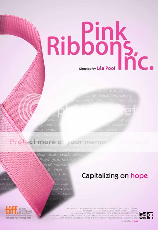
Pink Ribbons, Inc. film poster ©2012 First Run Features, all rights reserved.
“We used to march in the streets. Now you’re supposed to run for a cure, or walk for a cure, or jump for a cure, or whatever it is,” states Barbara Ehrenreich, breast cancer survivor and author of Welcome to Cancerland, in the opening minutes of the documentary Pink Ribbons, Inc. Directed by Canadian filmmaker Lea Pool and based on the book Pink Ribbons, Inc.: Breast Cancer and the Politics of Philosophy by Samantha King, the documentary features in-depth interviews with leading authors, experts, activists and medical professionals. It also includes an important look at the leading players in breast cancer fundraising and marketing. The production crew filmed a number of prominent fundraising events across North America, using the upbeat festivities (where some didn’t even visibly show the word ‘cancer’) as the backdrop for exploring the “pinkwashing” of breast cancer through marketing, advertising and slick gimmicks. At the same time, showcasing well-meaning, enthusiastic walkers, runners and fundraisers is a double-edged sword and was handled with the appropriate sensitivity by the filmmakers. Pool wanted to “make sure we showed the difference between the participants, and their courage and will to do something positive, and the businesses that use these events to promote their products to make money.”
Often lost amidst the pomp and circumstance of these bright pink feel-good galas is that the origins of the pink ribbon are quite inauspicious. The original pink ribbon wasn’t even pink. It was a salmon-colored cloth ribbon made by breast cancer activist Charlotte Haley as part of a grass roots organization she called Peach Corps. From a kitchen counter mail-in operation, Haley’s vision grew to hundreds of thousands of supporters, so much so that it caught the attention of Estee Lauder founder Evelyn Lauder. The company wanted to buy the peach ribbon from Haley, who refused, so they simply rebranded breast cancer to a comforting, reassuring, non-threatening color: bright pink. And before our very eyes, a stroke of marketing genius was born.
As the pink ribbon movement took hold of the fundraising community, the money started to spill over into mainstream advertising, adorning everything from the food we eat to the clothes we wear, all under the auspices of philanthropy. In theory, people should feel great about buying products that return some of their profits for such a great cause. In practice, many of these campaigns simply throw a bright pink cloak over false, if not cynical, advertising. Take Yoplait’s yearly “Save Lids to Save Lives” campaign:
For every lid you save from a Yoplait yogurt (and mail in, using a $0.44 stamp, mind you!), they will donate 10 cents to breast cancer research. If you ate three yogurts per day for fourth months, you will have raised a grand total of $36 for breast cancer research, but spent more on stamps and in environmental shipping waste. Not as impressive when you break it down, eh?
A recent American Express campaign called “Every Dollar Counts” pledged that every purchase during a four month period would incur a one cent donation to breast cancer research. Unfortunately, they never quantified donations commensurate to spending, so that meant whether you charged a pack of gum or a big screen TV to your AmEx, they would donate a penny. The breast cancer community was so outraged by this hubris, they staged a successful campaign to rescind the ads. The fact is, the above examples demonstrate that pink ribbons have become an industry, with demographics and talking points, just like everything else. Pinkwashing campaigns tend to target middle class, ultra-feminine white women. Why? Because they are typical targets that move the products these industries are trying to sell. Take the NFL’s recent pink screening campaign. Well-meaning or not, it came amidst a series of crimes and violence by NFL players, some of which was domestic in nature. One can imagine that players adorned in hot pink gear would have been a smart way to mollify its rather impressive female fanbase.
As Ehrenreich states in the documentary, the collective effect of this marketing has been to soften breast cancer into a pretty, pink and feminine disease. Nothing too scary, nothing too controversial. Just enough to keep raising money that goes… somewhere. Take a look at the recent chipper television campaign for the Breast Cancer Centre of Australia:
While some of the breast cancer-related branding and pink sponsorships mislead through good intentions, others are a dangerous bold-faced lie. Some of the very companies that sponsor fundraising events and make money off of pink revenue either make deleterious products linked to cancer or stand to profit from treatment of it. Revlon, sponsors of the Run/Walk for Women, are manufacturers of many cosmetics (searchable on the database Skin Deep) that are linked to cancer. The average woman puts on 12 cosmetics products per day, yet only 20% of all cosmetics have undergone FDA examination and safety testing. The pharmaceutical giant Astra Zeneca can’t seem to decide if it’s for or against cancer. They produce the anti-estrogen breast cancer drug Tamoxifen, yet also manufacture the pesticide atrazine (under the Swiss-based company Syngenta), which has been linked to cancer as an estrogen-boosting compound. Breast cancer history month (October) is nothing more than a PR stunt that was invented by a marketing expert at… drumroll please… Astra Zeneca! Their goal was to promote mammography as a powerful weapon in the war against breast cancer. But as the American arm of the largest chemical company in the world, the reality is that Astra Zeneca was and is benefiting from the very illness it was urging women to get screened for. Perhaps the most audacious example of them all is pharmaceutical giant Eli Lilly. Sponsors of cancer research and treatment, both in medicine and the community, Lilly produced the cancer and infertility causing DES (diethylstilbestrol), and currently manufactures rBGH, an artificial hormone given to cows to make them produce more milk. rBGH has been linked to breast cancer and a host of other health problems. These strong corporate links in many ways explain the uplifting, happy, sterile messaging behind the pink ribbon. Corporations are, quite bluntly, making money off of marketing cancer, so if they don’t put a smiley face on the disease, they will alienate their customers and the conglomerate businesses pouring money into these campaigns.

In a scene from Pink Ribbons, Inc., a group of walkers (clad head to toe in hot pink) in the Susan G. Komen Race For the Cure San Francisco.
Juxtaposed with the uplifting, bombastic, bright pink backdrop of the various cancer fundraisers and rallies, Pink Ribbons, Inc. quietly profiles the IV League, an Austin, TX-based support group for metastatic breast cancer. The women meet on a regular basis to share stories, help each other cope and accept the rigors of the disease and realities of dying. Many of the group members interviewed found current breast cancer campaign marketing offensive, tastelessly positive and falsely empowering (“If you just get screened and get mammograms and eat healthy, breast cancer can’t happen to you!”). The group, which has lost 10 members last year alone, is among a large faction of cancer sufferers that feel left out in the pinkwashing tide of marketing campaigns. Highlighting that sometimes you do get cancer because of no explanation, and sometimes you won’t respond to any treatment is a downer. It’s not the kind of uplifting story that advertising campaigns are built around, leaving the women feeling as if they’re living alone with the fact that they are dying. “You’re the angel of death,” remarks IV Leaguer Jeanne Collins. “You’re the elephant in the room. And they’re learning to live and you’re learning to die.” By utilizing powerful messaging keywords like BATTLE, WAR and SURVIVOR, cancer foundations and brands are subliminally putting down those who didn’t survive. And there are many who don’t survive — someone dies of breast cancer every 69 seconds. Are they suggesting that people who died or didn’t respond to treatment simply didn’t try hard enough? One of the most poignant moments in the film was an IV League Stage 4 cancer patient, probably weeks or months from her death: “You can die in a perfectly healed state.”
Although Pink Ribbons, Inc. is a sobering polemic against the mindless trivialization of commercializing breast cancer and even misdirecting funds from where they can be most helpful, it is not a hopeless film. Far from projecting pessimism, the film showcases the tremendous willpower and manpower that these three-day walks engender. It is simply misdirected. If hundreds of thousands of women and men can be motivated to fundraise, walk, run and (in some cases) jump out of planes, the effort is absolutely there to stop breast cancer. “Do something besides worry to make a difference,” concludes Barbara Brenner. “We have enormous power, if only we’d use it.” Director Lea Pool hopes that the film will encourage people to “be more critical about our actions and stop thinking that by buying pink toilet paper we’re doing what needs to be done. I don’t want to say that we absolutely shouldn’t be raising money. We are just saying ‘Think before you pink.’”
Watch the trailer for Pink Ribbons, Inc. here:
Pink Ribbons, Inc. goes into wide release in theaters nationwide June 8, 2012 and was released on DVD in September of 2012.
~*ScriptPhD*~
*****************
ScriptPhD.com covers science and technology in entertainment, media and advertising. Hire our consulting company for creative content development.
Subscribe to free email notifications of new posts on our home page.
]]>
“Ask your doctor if this hard-to-pronounce medication is right for you.” Sound familiar? It should. Over the last decade, it’s become difficult to watch an hour of television or read a magazine without running into a commercial for the latest cure for (insert disease here). For all of their ubiquity, the majority of ads are shockingly bereft of uniqueness. Bland, boring, and banal, they represent some of the worst of science creative in modern media. Here at ScriptPhD.com, we couldn’t think of a more appropriate category for the next installment of our ongoing advertising series “Selling Science Smartly.” Rather than expound on the plethora of bad pharmaceutical ads, we deconstruct a near-perfect Pfizer campaign out of Canada and interview the executive creative director behind the concept. Read our complete article under the “continue reading” cut.
Campaign: Pfizer “More Than Medication” (television, web)
Agency: Crispin Porter + Bogusky (formerly Zig Toronto)
Industry: Pharmaceuticals
1999 was a seminal year in the long history of direct-to-consumer marketing of drugs and pharmaceutical products. No, this was not the year that they debuted. In fact, the selling of chemicals and potions goes back to the early 1900s, when deceptive patient ads (snake oil remedies) made up to 50% of advertising revenue for newspapers. Significant changes didn’t occur until 1938, when Congress passed the Federal Food, Drug & Cosmetic Act that stipulated, among other things, that a drug had to be proven safe and effective before it could be marketed. In the early 1980s, when marketing of drugs spilled over from medical professionals to consumers, the FDA requested a brief moratorium on televised ads, which it lifted two years later, requiring only that the ads include a brief summary of the drug’s side effects, contraindications, warnings, and precautions, and provide “fair balance” between the drug’s risks and benefits (see terrific review). It wasn’t until 1999 that the FDA greatly loosened these requirements, only asking that advertisers provide information about side effects in the audiovisual presentation. The rest, as they say, is history.
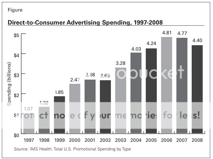
Direct-to-consumer advertising spending, 1997-2008.
The result of this deregulation of oversight has been an outright torrent of television and print ads over the last decade peddling panacea for everything from depression to restless legs. The table above shows the steady rise in overall spending on direct-to-consumer marketing since the FDA amendment. While the recent recession has somewhat tempered spending, the sector has not suffered to the degree that others have. And while it is true that ad agencies have to contend with much more stringent FDA guidelines for required content (such as warnings, side effects, and medicinal purpose) for drugs than for almost any other product—a unique, difficult creative obstacle—the fact is, pharmaceutical ads are many, and many aren’t good.
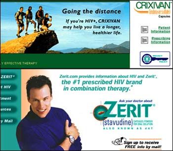
A 2001 print advertisement for the HIV cocktail medication Zerit that garnered harsh criticism.
Remember that R.E.M. song “Shiny, Happy People?” It could be the anthem of the majority of pharmaceutical ads. You may not know what this medication is for, but it will make you smile as you run in slow motion through fields of sunflowers (assuming that you don’t have allergies; there’s a different commercial for that). Why not ask your doctor about it?? Take for example the egregious, bordering on offensive, 2001 print ad in the picture on the right for the HIV cocktail Zerit. A handsome, chiseled, smiling model in the foreground offers palliative assurance for a disease that scientists have found no cure for, while a group of background “patients” climb a symbolic mountain. The ad was roundly excoriated as the “Joe Camel of drug ads,” and even contributing to an epidemic of unsafe sex by making false promises and misleading impressions. (Actual side effects of HIV cocktail therapy can be so painful and debilitating that some patients refuse treatment.) According to an article in the trade magazine Advertising Age, just last year, the FDA admonished a group of 14 leading pharmaceutical companies for what it claims are misleading, misbranded ads on search engines such as Yahoo! and Google. Some wonder outright whether the proliferation of pharmaceutical marketing, now seen equally as a luxury for the healthy as a necessity for the sick, is having a deleterious effect on medicine.
It is within this cluttered field of profligate, if trite, advertising that an exceptional, authentic campaign out of Canada caught our eye. Geared towards encouraging personal health and wellness, the “More Than Medication” campaign for Pfizer by the Toronto office of ad agency Crispin Porter + Bogusky includes a series of well-produced, well-written television ads (mini-films, really) and a informative website. The storytelling within the two films, “Graffiti” and “Breathe,” is a particular highlight. We dare you to watch the first video, “Graffiti,” all the way through without crying.
Why it’s good science advertising:
The cleverness of CP+B’s “More Than Medication” campaign is 50% in the content that’s there, and 50% in the content that isn’t. Missing are the saccharine smiles, ridiculous athletic feats and idyllic dalliances of perfectly healthy people that never took the medication they’re purporting to be endorsing. Rather than portraying people who could be anyone (or, sadly, no one), these ads are the antithesis. “More Than Medication” is about life—mundane, radiant, lifechanging, heartbreaking. Through all of these milestones, Pfizer is attempting to build relationships one person at a time, and be a valuable presence in their healthy lives at their most important stages. Only time will tell if the campaign pays dividends, but as advertising strategy, it’s brilliant. Pharmaceutical companies rely on wholescale batch assembly at every stage of development, from searching for molecules as drug candidates, to researching them, to the mass production thereof. In fact, the fermentation tanks developed by Pfizer that enabled the first-ever mass production of penicillin during World War II became a national historic landmark in 2008. This doesn’t dictate that pharmaceutical ads must follow the same standard operating protocol.
Why it works:
Beyond “reinventing” pharmaceutical advertising, the “More Than Medication” campaign taps into an important (and growing) wellness zeitgeist being embraced by the professional and private health care sectors. Within the last few years, emphasis has shifted significantly from medication to meditation, pills to pilates, and technology to tofu. Individual preventitive care, including eating habits, exercise, healthfulness beyond chemicals, and individual responsibility, has been gaining momentum as a critical component of modern medicine, nowhere more than in how it is advertised. Kaiser Permanente’s enormously successful and popular “Thrive” campaign, recently expanded to the tune of $53 million, has echoes the welness call to arms of Canada’s “More Than Medication” spots. Internal documents indicate that the 2004 campaign was launched to combat a declining membership of 150,000 in a similarly reviled industry (health insurance). The initially modest reach has since expanded to print, outdoors, television and radio.
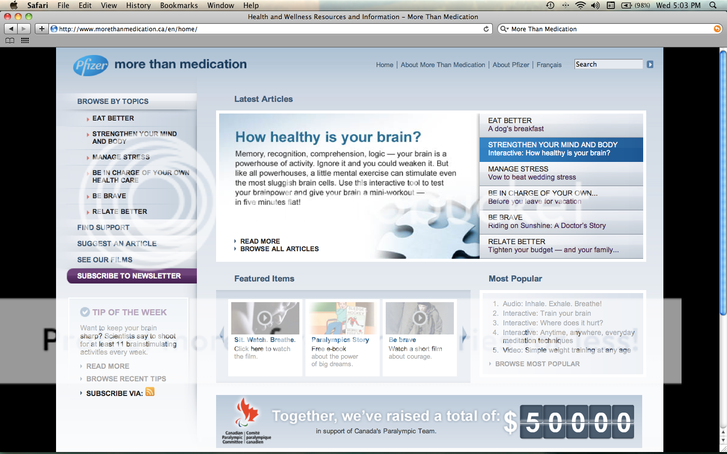
The home page of the "More Than Medication" website.
Pfizer supplemented their television spots with an interactive website that offers resources for individuals and their families, including eating better, strengthening mind and body, practical life tips, and places to find help to achieve these goals. In doing do, the pharmaceutical behemoth rebrands themselves as in touch, personally connected on an individual level and convey that they care about their patients’ health even if it means never having to take one of their medications.
What other science campaigns can learn from this one…
In Selling Science Smartly, don’t be afraid to be emotional. It seems like contradictory advice. Science and medicine are precise, technical and exacting, and needfully so. What they are not is antiseptic. Ask the medical doctor and nursing staff that spend days, weeks and months getting to know patients and integrated into their lives. Ask the patients and families who experience some of the most emotionally-charged moments of those lives (both joyous and sorrowful) in a hospital. Ask the scientist that slaves away at the bench in the hope that his or her efforts might save or improve lives. How do I know this last one? Because I was one of them. I did a large chunk of my PhD graduate thesis in a Novartis not-for-profit research institute doing drug discovery. My experiments led to a target candidate for acute myeloid leukemia (largely affecting young patients) which is currently being tested in mice. The exultation of a successful experiment and reward of hard work was far supplanted by pure elation at the thought that a life saved far in the future was because of my contribution. There is emotion in science and medicine; indeed, there can be no precision without passion. The role of a good creative is to extrapolate and harness it effectively. To all of my colleagues in labs and hospitals across the world and to all of the patients that their work ultimately affects, a campaign such as “More Than Medication” is a fitting tribute.
Questions for Aaron Starkman, Executive Creative Director—“More Than Medication” campaign for Pfizer
ScriptPhD.com: What was the client’s primary objective with this campaign and how did it lead to the development of the “More Than Medication” concept?
Aaron Starkman: The client wanted to create a bond of trust with consumers. Research showed that consumers don’t trust drug companies, and believe that they put profits before people. In Canada, we also have health care system issues with limited physician access and pressure on doctors to spend less time with patients. Canadians feel powerless when it comes to their health.
We knew that in order for Pfizer to build trust, we had to show Canadians that Pfizer’s point of view was different from other pharmaceutical companies; that, as a company, they believe that wellness is not achieved by taking pills, but about a more holistic, balanced approach that doesn’t require any of their drugs at all. “More Than Medication” was the freshest and clearest expression of our core idea. It takes a lot of people by surprise that a pharma company would take such a stance.
SPhD: Big pharma can be publicly perceived as a bottom line, profit-driven pill dispenser. Additionally, people’s eyes tend to glaze over when dealing with any scientific or medicinal concepts. How did these dual challenges figure in the ultimate mapping out of the “More Than Medication” campaign?
AS: We couldn’t let the work we did reinforce any of the negative perceptions of the pharma industry. We took the completely opposite tack to traditional pharma campaigns which typically focus on research and innovation and how that benefits people. Ultimately, those messages don’t resonate because they are company focused, not people focused. To break through, Pfizer had to shed all of the baggage and aim for a more insightful, emotional high ground which no other pharma company has done, even to this day.
SPhD: The “Be Brave” and “Breathe” videos for this campaign have a tremendously cinematical composition and emotional resonance, above and beyond the feel of a typical :30 or 1:00 ad. Can you speak to the creative development of these “mini-movies”?
AS: Internally, we refer to them as films. And that’s how our director John Mastromonaco treated them. John is a brilliant director and he’s really amazing at developing characters quickly. In “Be Brave” viewers go from feeling that the main character is a thug, to empathizing with him, to getting to know his family, to realizing he’s an amazing brother and a good person- that’s a lot. But John and his production company Untitled Films really believed in the project and the message Pfizer wanted to convey. And they were amazing partners throughout both projects.
SPhD: The ad campaign was launched in 2008. What has been the tangible impact to Pfizer and across Canada?
“More than medication” is more than a campaign – it’s a mantra that has positively impacted how Pfizer behaves as an organization. It’s been culture shifting for them. Externally, it has raised brand scores across a variety of metrics, trust being one of them.
SPhD: Biggest piece of advice for tackling an unorthodox campaign in a technical or dry field (in this case biotech/pharma)?
AS: Be brave.
SPhD: What’s a current ad campaign or creative concept that you really like and why?
AS: I love a non-traditional campaign from Sweden for Swedish Postal Service. They created their own celebrity called ‘Stefan the Swopper’. This guy became famous because he used social media to get out his message. And his message was that he wants to trade every single thing he owns – from his car right down to his toothbrush and boxer shorts. When people asked for details on how the swapping can work, Swedish Post’s service was revealed by Stefan. The campaign was an unbelievable success and a revolutionary way for a client to launch a service.
Take a look at this short video chronicling the clever ‘Stefan the Swopper’ viral campaign construction and its effects in marketing the Postal Service in Sweden:
ScriptPhD.com gratefully thanks Stephen Sapka and Aaron Starkman from Crispin, Porter + Bogusky for their time, coordination and enthusiasm for this project.
~*ScriptPhD*~
*****************
ScriptPhD.com covers science and technology in entertainment, media and advertising. Hire our consulting company for creative content development.
Subscribe to free email notifications of new posts on our home page.
]]>
Much of today’s messaging about the environment, green initiatives and ways for the public to make a difference physically and fiscally are centered around media and advertising. To wit—even amid the deepening recession, one market has seemed to defy the economic downturn: green and environmentally-friendly product launches. Sadly, however, a large and growing subset of the eco-conscious creative collective is enveloped in hyperbole and hubris, a term the industry has labeled “greenwashing” that we will discuss in much greater detail in another article. It was natural then, that as part of our Earth Week coverage, ScriptPhD.com undertook green advertising as part of our continuing “Selling Science Smartly” series. Here, we profile a case study of several impressive (and effective) campaigns by the West Coast-based RIESTER, including work on recycling, clean air, and the first fully-integrated municipal sustainability campaign in the US. We also had an opportunity to speak with RIESTER’s executive team, who provided insights into their creative strategy, why green advertising is more challenging than ever before, the crucial importance that interactive played in their success, and why every agency should be blogging more.
Campaigns: CalRecycle’s “Bottles and Cans” and STAND FOR LESS campaigns; Maricopa County’s Clean Air Make More Campaign (print, television, interactive)
Agency: RIESTER (Los Angeles, Phoenix, Salt Lake City)
Industry: Environment, Sustainability
If it seems like RIESTER is ideally suited to forge new ground in environmental advertising, they are. As a self-described ensemble of “brand activists,” RIESTER has taken on important social, health, technology and sustainability causes that transcend any individual campaigns or creative material. They’ve woven impact into the fabric of their 20-year identity to become one of the largest independent advertising and public relations firms in the United States. Their “Great Salt River” cleanup campaign resulted in one of the greatest single-day volunteer turn-ups in American history. A mid-90s shocking anti-tobacco campaign was so successful in curbing teen tobacco consumption, that it garnered the attention of major national media outlets. Likewise, their campaign with Gold’s Gym partnered with the American Diabetes Association, and gym members, to fight America’s growing obesity problem. Having written extensively about the environment on their blog, RIESTER has shown dedication and commitment to impacting real change with meaningful, long-term work. Here are several of their recent efforts.
A clever, funny spot devoted to clean air awareness in Maricopa County, Arizona (notoriously fraught with pollution and smog problems):
In 2009, San Diego became the first city in America to initiate a fully-integrated sustainability marketing campaign to encourage citizens to use less energy, water and vehicle mileage and to recycle more. Here are a series of television spots for the San Diego STAND FOR LESS Campaign:
And finally, an exceptionally smart, unusual ad for the California Department of Conservation touting the value of recycling from a most different perspective:
Why we like it:
Plain and simple, these campaigns are different. RIESTER has managed to tap into a creative channel that reaches its audience in a new, clever, sly way. When was the last time you saw a commercial or billboard about recycling that anthropomorphized the object being recycled? The answer is probably never. More than likely, the spot you saw showcased sad pictures of yet another ravaged, pillaged section of our fraying Earth, or graphics touting the benefits your behavior has to our environment. This spot takes those arguments, and flips them 180 degrees. It’s cute, it’s funny, and that bottle has some kind of attitude! The result? Since the campaign’s launch, California increased their recycling rates by 16%. Likewise for the Maricopa County clean air spot. Arizonans are constantly bombarded with appeals and rations stave off pollution problems. This commercial is flat-out ridiculous… and ingenious. Even in Beijing, one of the most consistently over-polluted cities in the world, people don’t walk around holding their breath from one location to the next. But the spot is positing an over-exaggerated situation to have people imagine a time when we would have to do such an unthinkable thing, and in turn, to drive them towards actions that would prevent it.
Why it’s good green advertising:
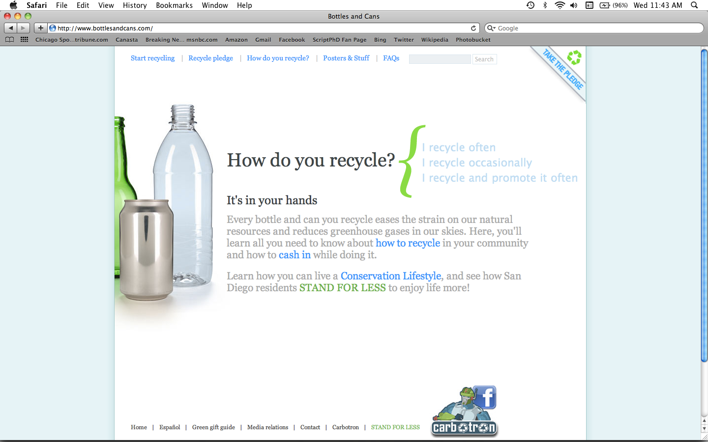
The CalRecycle website engages with its audience interactively, providing a platform for change.
Nobody likes being told what to do. Any parent of a 2-year-old toddler can attest to this. And no one likes being guilted into doing something. Neither is a strong motivation for long-term behavioral change. Where RIESTER veers smartly from this staid formula is in fully engaging with their audience on a nonjudgemental level. Crushing and recycling a can, something that can hardly be compared to the equivalent of, say, buying a Prius, becomes significant to them. Take a look at the CalRecycle website pictured on the left. It asks rather than tells, and it includes all participants of recycling, even those who never recycle. That’s significant. Too many environmental initiatives fall into the trap of preaching to the choir, never reaching a new target audience that hasn’t been exposed to the message. Here, an interactive campaign groups you togehter, whether you’re a granola-eating, hemp-clad, lean mean green machine, or you have never even thought about recycling before. Engaging the entire community together, and providing them with the necessary know-how for sustainable behavior, is the only functional long-term solution.
Why it works:
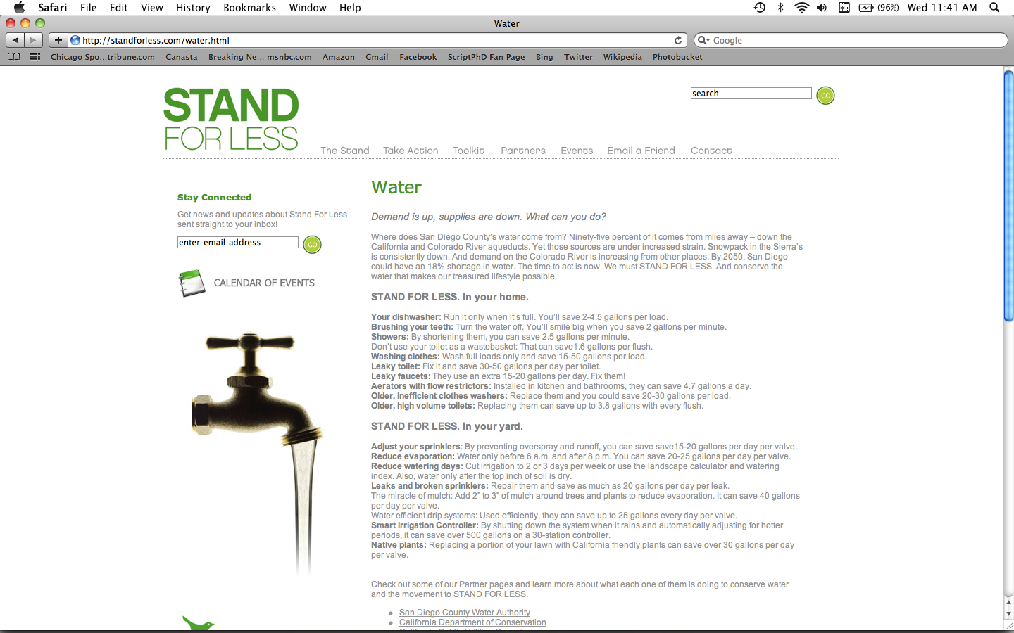
The STAND FOR LESS website and blog.
RIESTER’s green campaigns, especially STAND FOR LESS, are truly interactive, and go a long way towards continuing long-term conversations about community sustainability. The advertising spots are really just the start of the conversation. For this, the STAND FOR LESS campaign was the rightful recipient of a 2010 Addy Award for an integrated campaign. The STAND FOR LESS site features a blog with a constant news stream, a calendar of events to get involved, a toolkit for individual activists who want to get involved, and informative content on ways to incorporate eco-conscious behavior into one’s own household. They take advantage of social media in a meaningful way, with both Facebook and Twiter feeds for people to exchange ideas. Research has clearly shown that simply providing people with information, especially in single doses, has little effect on individuals and businesses. Instead, a community-based model of social marketing has emerged to encourage sustainability practices. STAND FOR LESS is an important start in what will eventually be a common model of urban initiative.
What other green science campaigns can learn from this one…
In selling green science smartly, don’t recycle ideas, pardon the pun. Be edgy, different, and think outside the box. A recent Gallup poll (released April 09, 2010), revealed that green behavior in the United States, although common, is not changing. Standard eco-friendly practices such as recycling, low-wattage light bulb replacement and purchasing decisions, have either increased marginally or not at all since 2000, when green advertising began bombarding the airwaves. Furthermore, there is an enormous collective guilt over the ideal we know we should be achieving, yet consistently fall short of. Advertising that feels sanctimonious will only reverberate this effect, rather than motivating people into significant change. When many people either don’t know where to start or feel overburdened by incorporating yet another lifestyle change into an already overscheduled and busy day, it’s important (as the STAND FOR LESS campaign does) to remind them that small, inexpensive actions incur an additive effect and do make a difference. The use of humor, irony and droll, tongue-in-cheek moments, like imagining how good recycling must feel for the bottle, are far more effective in sparking and retaining dynamic conversation than either direct information or ham-handed appeals. Getting people’s attention like this is especially critical in the face of an onslaught of green noise in labeling and product availability, many of which are under no obligation to prove their claims. Indeed, the New York times noted that as of 2008, the advertising industry was significantly pulling back on eco-friendly marketing due to growing public skepticism of ads with environmental messages. The take home lesson is that agencies will simply have to work harder and smarter than back in the days when we were all a little green about being green.
ScriptPhD.com caught up with RIESTER Executive Creative Director Tom Ortega and Editorial Director Jim Breitinger to talk about their conservation work, the thought process fueling their smart “green” creative, why interactive is imperative, and what makes for good environment advertising in our cluttered, hyper-messaged media.
ScriptPhD: RIESTER proudly proclaims themselves as a collective of “brand activists.” Can you shed a bit more light on your definition of “brand activist” and how that influences your creative philosophy when it comes to science, technology and particularly sustainability advertising?
Tom Ortega: RIESTER has a long history of working with clients who have a purpose beyond commercialism, which is the statement that you see on our website. What that means is that our clients do much more than serve an immediate need for a consumer. So while we do a lot of work for [non-sustainable] products, we’ve found other connection points as well with the consumer so that the consumer can develop a longer-lasting relationship with those brands. The idea of becoming activists has two sides to it as well, because we feel that when consumers become true believers in a brand, they themselves become activists for those brands. And their voice is certainly greater than any voice that can be heard. We all know the power of the word of mouth, right? That’s what we’re able to create, whether it is for a pure sustainability campaign, or a packaged good product that really connects with the consumer.
Jim Breitinger: The term is also an organic outgrowth of, really, who we are, the kind of business we go after, and the clients we have. We become incredibly passionate about who they are and what their cause or product is. We’re the activists who go the extra mile for the client.
SPhD: So much of impacting pro-environment and sustainability efforts involves changing behavior and wielding persuasion. Ironically enough, this is exactly what advertising is in the business of doing. In your minds, have agencies been underutilizing the power of social marketing and what are some of the areas you’d like to see it expanded, both in content and risk-taking.
TO: Agencies, over the past five years, have become very smart about human behavior, and recognizing how brands connect with that behavior. What you’ve seen over the past years has been a growth of research and planning involved in advertising campaigns. So I don’t know if it’s been underutilized. What makes RIESTER different is that we have an in-house planning department that has researchers who are working here every day who understand social change, human behavior, why people do things—whether it has to do with recycling or buying a specific product. For us, behavior change is something that we take very seriously, it leads most of our campaigns when it comes to research and developing a foundation for the campaign.
Part of what’s tricky about advertising in the “green” arena is the word “green,” which has certainly lost its meaning. This is due to the greenwashing that has occurred throughout the past number of years. It reminds me a lot of the nutritional advertising that was done years ago with all of the blanketed “fat free” nutritional messages that were put out there. I think environmental marketing runs the risk of neutralizing itself with messages that really aren’t relevant or really don’t have meaning them. It’s important to understand that consumers are smart, consumers are worn out and getting message fatigue, and we have to make sure that this message has meaning behind it. When we’re telling people a certain product or behavior has sustainable practices, it darned well better fit that bill.
SPhD: As is the case for many science and technology ads, there is a tendency for environment, social awareness and sustainability messages to be anodyne or milquetoast. One of the things I love about your California recycling campaigns (video and print) as well as the Maricopa County Clean Air campaign is the use of humor and irony. Very clever stuff! Take us through some of the creative strategy for these spots and how you hoped to get the messages across.
TO: Well, human beings want to be entertained. We owe it to them, if we’re going to take up thirty seconds of their time, to entertain them to a certain degree. Because if we don’t, they’re not going to pay attention to the message. So it’s important for us to create a message they’ll want to watch. Humor is a great way to do that. It’s also a wonderful way of breaking down barriers that might already be there. The idea of air pollution is sort of a hackneyed idea. We’ve been hearing it over and over again for years, and you have to get people to pay attention to that message, to demonstrate that it is relevant to their lives.
For the California recycling campaign, “Good For the Bottle, Good For the Can,” it was funny because in California, people really understand, they get it. It’s the original environmental state. But in order to get deeper with it, we had to commit it a lot differently, and not just state that it’s good for the planet. That message has already reached the target that cares about that. We had to reach a different target, and talk about the fact that it was good for these cans and bottles, and sort of personify these as beings that would go on to live another life. You have to get people to look at things differently—that’s part of behavior change.

RIESTER Editorial Director Jim Breitinger stands for less in the mountains with his dog.
SPhD: Let’s spend some time talking about the impressive STAND FOR LESS campaign. When you have a city approach you about a wide-scale campaign like this, what are some of the first things that go into laying down a foundation, or groundwork for the overall message?
TO: The most important part of that campaign was to organize the coalition of members, the people and partners to this, and that was really spearheaded by Mirja Reister, our executive planner. She worked tirelessly to bring together partners from the private and public sectors to get them in the same room and working together. In order for it to be a successful, integrated, city-wide campaign, we had to have all these people participating and taking an interest in this.
On the communications side, we worked on creating the STAND FOR LESS blog and the social network link that we have created. It’s an amazing site to look at in terms of both the outreach that has occurred and the momentum that the campaign has managed to develop.
SPhD: Who are some of the people you worked and consulted with as you developed the TV and radio spots? I know Jim mentioned you worked with Ed Begley, Jr.
TO: Ed was there at the launch of the campaign because he has such a key interest in this. [For] the television campaign that you saw, the original thought on that boiled down to: the message is “STAND FOR LESS,” so the advertising itself has to “STAND FOR LESS.” We wanted 15 second commercials, not 30 second ones. We wanted a stripped-down set, not an elaborate set. We wanted the spots to be cost-efficient in terms of the money that was used to make them, because we wanted to demonstrate that we could make commercials for less. Everything that went into that, even the production itself, was a fully sustainable production. There had to be recycling on the set. We paid attention to the location where we shot it, because we didn’t want people to drive far. Everything was thought out. We wanted to make sure that we weren’t just saying it, but that we were doing it.
SPhD: What kinds of effects has the campaign incurred in San Diego? Any lessons from it for future work (good or bad)?
JB: It gets back to the whole kernel or the idea behind the campaign, of bring together people who were already working on these issues. When I’ve been in San Diego (and I moved there to work on this campaign), I was really focused on finding people on the ground who were really making a difference. Finding those truly authentic characters who were standing for less in San Diego. And I think it’s made a big difference in the community in that sense, that it has brought those people together, the Surfrider Foundation, The Center For Sustainable Energy, San Diego Gas and Electric, the different government entities we’ve worked with. These are people who are all doing great things but not necessarily communicating on a daily basis. In that sense, I think that’s been the greatest effect on this campaign, is uniting people who have that common cause, who really care about sustainability.
As for behavioral change in the population, there’s been progress and I’ve posted a few things on the blog to that effect. [The mayor of San Diego and the US Navy are both Standing For Less.] Definitely increases in recycling, and there have been other benchmarks of success on this campaign.
SPhD: For a campaign as ambitious and far-reaching as STAND FOR LESS (effectively changing the behavior of the sixth-largest city in America), how important was the use of interactive (which included a website, PR, and radio and television spots)? How important is the use of interactive in general in green and sustainability advertising?
TO: That’s key, that’s where your community is. That’s also where you build your community. It starts through websites, you’ve got to use other networks like Facebook and so forth, and that is essential to give people a place to go. You have to give people a website to go to for information. And then you have to give them outlets where they can connect with other people who are like them. That’s how you build a community that stands for less. The internet is at the heart of a campaign like this. Twenty years ago, we would have told you TV was it. TV was simply, in this case, the tool to drive awareness and to get people to the website. But once you get people on that website, and connected, that’s where the inertia begins.
JB: And that’s the brilliance of this campaign. It connects the dots, it connects all these different tribes that are out there already and helps with the broader population, who may or may not be paying attention.
TO: If you’re going to start a conversation like [this] with someone, it’s essential to keep it going. That’s why you have these social networks that you have to utilize. You can’t just talk once about it. And it goes back to behavior change. Behavior change doesn’t happen overnight—we didn’t develop these behaviors overnight. We didn’t start drinking out of plastic bottles overnight. Getting people to stand for less or to drive less or to think about where their food comes from, these are behaviors that will take a LONG time for us to change, but if we keep that dialogue going, you really stand a better chance of doing it.
JB: One of the things about this campaign is that although it’s under the banner of “standing for less,” it’s not about austerity or denial. There was a lot of messaging in the late 70s, when I was a kid, that the environmental movement turned off a lot of people, because it was about denying yourself. With STAND FOR LESS, a lot of the things I’ve written about, I’ve tried to emphasize the idea of creating more, more green space, or an opening where you have a richer life. You don’t have to drink out of a single-use plastic water bottle to get your water, and it’s been fun to point out things you can do without necessarily denying yourself anything.
SPhD: I have long advocated the power of blogging as a great platform to extend ideas, start and continue important conversations and convey an agency’s (or company’s) cultural and creative identity. The RIESTER blog stands out for some really terrific editorials and posts on everything ranging from the environment to health and education. Why do you have such a cross-agency commitment to blogging?
JB: At the end of the day, we’re in the idea business. And as you point out, a blog is just a place to post things. But it’s a great platform for us to put the ideas out there. And we’re an agency full of people who have a lot of great ideas.
TO: It goes back to the idea of us being activists for our clients. We’re passionate about our clients, and the topics that we take on. It could be about recycling or selling salsa. We believe in it, and we’re going to live it every day. Blogging is a big part of that.
JB: The other thing is that we’re a creative agency, so people want to come to our website and that’s the first thing they want to see—our work. A blog is really a great place to both showcase some of our creative work and to provide some depth to it, and to explain what’s behind it and who we are and what’s driving us to create what we do.
SPhD: Finally, tell our readers a bit about the RIESTER Foundation and their efforts during the recent Haiti tragedy.
TO: We’ve spent so many years talking to people about their behavior and changing their behavior, and recycling and driving less and all that stuff, it became time for us to do something ourselves that had a lot of meaning to it. Securing habitat in threatened areas became a way for us to do that. The RIESTER Foundation became a way for us to put our money where our mouth was. You emailed me a question about how advertising agencies aren’t often thought of doing these types of things, and the fact is that we create things that live and die in a matter of a month or two, when it comes to ads. To be able to do something that has a longer life and that can live far beyond us is very important to us.
Check out RIESTER’s creative work, campaigns and blog on their main website. Thank you to Executive Creative Director Tom Ortega and Editorial Director Jim Breitinger for taking the time to be a part of our Earth Week edition of “Selling Science Smartly.”
~*ScriptPhD*~
*****************
ScriptPhD.com covers science and technology in entertainment, media and advertising. Hire our consulting company for creative content development.
Follow us on Twitter and our Facebook fan page. Subscribe to free email notifications of new posts on our home page.
]]>
When it comes to the interface of art and science, in many ways Madison Avenue finds itself in the position of the early days of sci-fi entertainment, where campy, unrefined productions took decades to evolve into the sophisticated films and shows we enjoy today. To be brutally honest, 95% of current science and technology advertising ranges from hackneyed to terrible; unimaginative, uncreative, uninspired. But here at ScriptPhD.com, we want to focus on the superlative 5%. What makes these campaigns work, what elevates their content above the crowd and most importantly, how do they fit within the theme of the science or industry they are promoting? This is why we are expanding our umbrella of coverage—which has heretofore included film, television and media—to the final frontier: advertising. In our brand new series entitled “Selling Science Smartly,” we will profile the best that science and technology advertising (print, TV, radio, digital and everything in-between) has to offer. Where possible, we will interview the respective campaign’s agencies and creative teams to give you a rarely revealed behind-the-scenes purview into the process and foundation of making these ads. We are proud to launch the series with the exceptional Dow Human Element campaign, including an in-depth interview with Creative Director and mastermind John Claxton of Draftfcb Chicago. For the full article, please click “continue reading.”
Campaign: Dow Human Element (print, television, web)
Agency: Draftfcb Chicago
Industry: Chemistry

Logo ©Dow Chemical company, all rights reserved.
Originally founded in 1897 by Canadian-born chemist Herbert Henry Dow, Dow Chemical Company is the second-largest chemical manufacturer in the world. Their primary output is plastics, including familiar products such as Styrofoam, Saran Wrap and Ziplock bags, but they also produce agriculture and performance chemicals, as well as hydrocarbon and energy materials. In 2006, Dow hired advertising agency Draftfcb Chicago to rebrand its image, with a corporate focus on working together to apply science to improve the human condition. The campaign was called “The Human Element” and was the recipient of a 2008 Effie Award for Corporate Reputation, Image and Identity. ScriptPhD.com has chosen this campaign for our Selling Science Smartly series because we feel it embodies a perfect combination of creativity, risk-taking, effectiveness and uniqueness to represent science at its pinnacle. Take a look at some of the spots below:
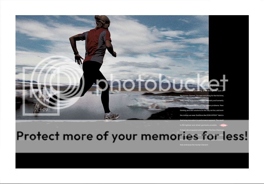
All images and logos ©Dow Chemical Company, all rights reserved.
Why we like it:

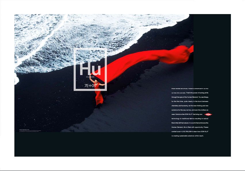
Photographer Steve McCurry's striking images have brought freshness and vitality to the Human Element campaign as it has aged.
How many times have you seen a formulaic pharmaceutical ad that could interchange virtually any product or drug without batting an eyelash? Or my personal pet peeve—a generic science ad with the now-standard happy researcher staring off into the sunset holding up a test tube of colorful liquid? These images are safe, boring, and ubiquitous. What makes The Human Element stand out is that it’s striking, gorgeous, poignant, different. The images within these ads are evocative, sensual, and they tell a story. The most recent versions of the campaign (pictured on the left) include the stunning photography of National Geographic photographer Steve McCurry. In advertising, the product is King and is showcased as such. However, in the case of science and technology, this leads to the same over-used imagery and tropes. It takes a lot of skill and bravery to attempt to tell a science story using abstract ideas, and I love that Draftfcb was willing to try. Because it has storytelling at its heart, this campaign is also malleable and adaptive to longevity, having just launched a series of supplementary web videos.
Why it’s good science advertising:
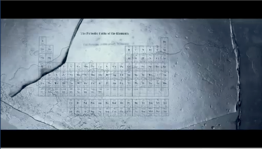
Image courtesy of Draftfcb Chicago.
Dow is a chemical company. They make chemicals. Using chemistry. This is their central corporate identity, and no advertising campaign would be complete without using that as its foundation. With a logo representing a “missing” element of the periodic table, and copy evoking the language and reaction processes of chemistry, The Human Element campaign condenses the most basic substance of what Dow Chemical does. With that logo containing an atomic number representing the global human population, it becomes instantly intimate and conveys the idea that science serves to advance humanity. Aesthetics aside, it’s a functional piece of branding that concomitantly reminds us the history of what Dow Chemical was established to stand for and looks forward to what it can achieve in the future.
Why it works:
The Human Element struck me, in essence, as a corporate rehabillitation campaign, and it succeeded on that level. While it has given us some practical and even beneficial products, Dow cannot escape a litanny of environmental transgressions (Union Carbide disaster in Bhopal, India) and the shame of being the sole provider of Napalm during the Vietnam War. CEO Andrew Liveris has expressed firm commitment to continuing an environmentally-sustainable corporate strategy, which has included successful collaboration with The National Resources Defense Council and being named by the EPA as the 2008 ENERGY STAR Partner of the Year for excellence in energy management and reductions in greenhouse gas emissions. One year into this advertising campaign, not only did the stock price of Dow appreciate 29%, but more importantly, their brand-equity rating skyrocketed by 25%. Secondly, large corporations such as Dow, particularly those in manufacturing industries, are conflated by activists and even ordinary citizens with greed, arrogance, environmental insouciance, and downright evil, something ScriptPhD wrote about earlier this year. These highly adhesive visceral impressions can be difficult to break. The Human Element campaign shows a subtle awareness of this fact, and, by focusing on people and nature, humility. Finally, Sandy Colkey, Executive VP at Draftfcb and head of the Dow campaign, commented that the ads were also effective in recruiting green-minded chemists and scientists to Dow, which only reinforces and amplifies the purpose of this campaign to begin with.
What other science campaigns can learn from this one…
The scientist does not study nature because it is useful; he studies it because he delights in it, and he delights in it because it is beautiful. If nature were not beautiful, it would not be worth knowing, and if nature were not worth knowing, life would not be worth living. Of course I do not here speak of that beauty that strikes the senses, the beauty of qualities and appearances; not that I undervalue such beauty, far from it, but it has nothing to do with science; I mean that profounder beauty which comes from the harmonious order of the parts, and which a pure intelligence can grasp.
- Henri Poincaré, physicist, mathematician and science philosopher
In Selling Science Smartly, don’t be afraid to be beautiful, lyrical and poetic. Science is a tool that utilizes rigor, precision and experimental design to reflect the natural beauty and wonder that does and can surround us. Moreover, the most analytical, objective scientist still has to employ out-of-the box thinking to stumble on a new discovery or solve a difficult puzzle. Good advertising should strive to communicate that. One of the biggest weaknesses (and challenges) in science advertising is resisting the temptation to construct campaigns with the same linear process that science experiments are fundamentally built around. Infusing creativity, lyricism and a humanist perspective help to make these ads accessible and empathetic, all qualities achieved superbly by the Human Element spots.
Interview with Draftfcb Creative Director John Claxton
The Human Element campaign was conceived and crafted by Draftfcb Chicago, recently named by Advertising Age as Number 5 on their Agency A List. ScriptPhD.com was honored to speak with John Claxton, Creative Director of the Human Element campaign and author of the print ads and TV spots.
ScriptPhD.com: When Dow first came to you for this rebrand, what was their overarching objective?
John Claxton: A new CEO, Andrew Liveris, was just establishing himself and his philosophy at Dow. He had put a great deal of thought and effort behind his mantra for the company—making Dow the most respected chemical company in the world—and was anxious to make it a reality.
SPhD: How much of the Human Element and its message of empowerment did they have input in?
JC: As a creative idea, the Human Element came from us. But their eagerness to redefine the company and their clearly articulated business goals left no question about which direction to go in. Dow had carefully laid the foundation. We simply provided the creative idea to bring their vision to life.
SPhD: Take us through a couple of key steps of the creative development to help us conceptualize going from point zero (a blank slate, essentially) to the final product.
JC: One of the first steps was a creative meeting at our agency during the “pitch process.” I walked into the meeting with a new element for the Periodic Table. . . not carbon, hydrogen or oxygen, but the Human Element.
That pretty much put everything in motion. Including the Human Element on the Periodic Table of the Elements changed the way Dow looked at the world and the way the world looked at Dow.
Every creative decision we made from that point on was filtered through the lens of the Human Element, and that’s what took us down a very non-science approach to science advertising.
SPhD: Tell me a little about the strategy and aims of the written portion of the campaign (the copy).
JC: In terms of the strategy, we knew we wanted to find a “voice” for the campaign that lived at the other end of the spectrum from traditional science advertising.
There were three things that inspired the “voice” of the campaign we ultimately landed on. Science essays. The writing of E. O. Wilson. And contemporary American poetry.
SPhD: What was the biggest challenge for your team on this project?
JC: The television shoots are incredibly time-consuming (most of them a month or more) and span several continents.
SPhD: In retrospect, what surprised you the most about this campaign?
JC: We were completely surprised by the passionate response from people at all levels of society. From teachers to politicians to parents, people were so moved that they felt compelled to write to the company and express their feelings. The campaign struck a nerve in a way that we had never imagined.
SPhD: What do you feel makes branding science and technology a different or unique creative proposition?
JC: It is very difficult to make something abstract like science relevant to people, particularly in traditional media like television and print.
SPhD: What’s your favorite commercial or print ad of all time?
JC: I know this will seem like heresy, Jovana, but I really don’t study advertising. In fact, I don’t own a television. I read science essays. I study human behavior. I study and enjoy contemporary poetry.
We thank the wonderful, talented advertising team at Draftfcb Chicago, including Creative Director John Claxton and Communications Manager Joshua Dysart, for their cooperation and help in this installment of Selling Science Smartly.
~*ScriptPhD*~
*****************
ScriptPhD.com covers science and technology in entertainment, media and advertising. Hire our consulting company for creative content development.
Follow us on Twitter and our Facebook fan page. Subscribe to free email notifications of new posts on our home page.
]]>


