As Comic-Con winds down on the shortened Day 4, we conclude our coverage with two panels that exemplify what Comic-Con is all about. As promised, we dissect the “Comics Design” panel of the world’s top logo designers deconstructing their work, coupled with images of their work. We also bring you an interesting panel of ethnographers, consisting of undergraduate and graduate student, studying the culture and the varying forces that shape Comic-Con. Seriously, they’re studying nerds! Finally, we are delighted to shine our ScriptPhD.com spotlight on new sci-fi author Charles Yu, who presented his new novel at his first (of what we are sure are many) Comic-Con appearance. We sat down and chatted with Charles, and are pleased to publish the interview. And of course, our Day 4 Costume of the Day. Comic-Con 2010 (through the eyes of ScriptPhD.com) ends under the “continue reading” cut!
Comics Design
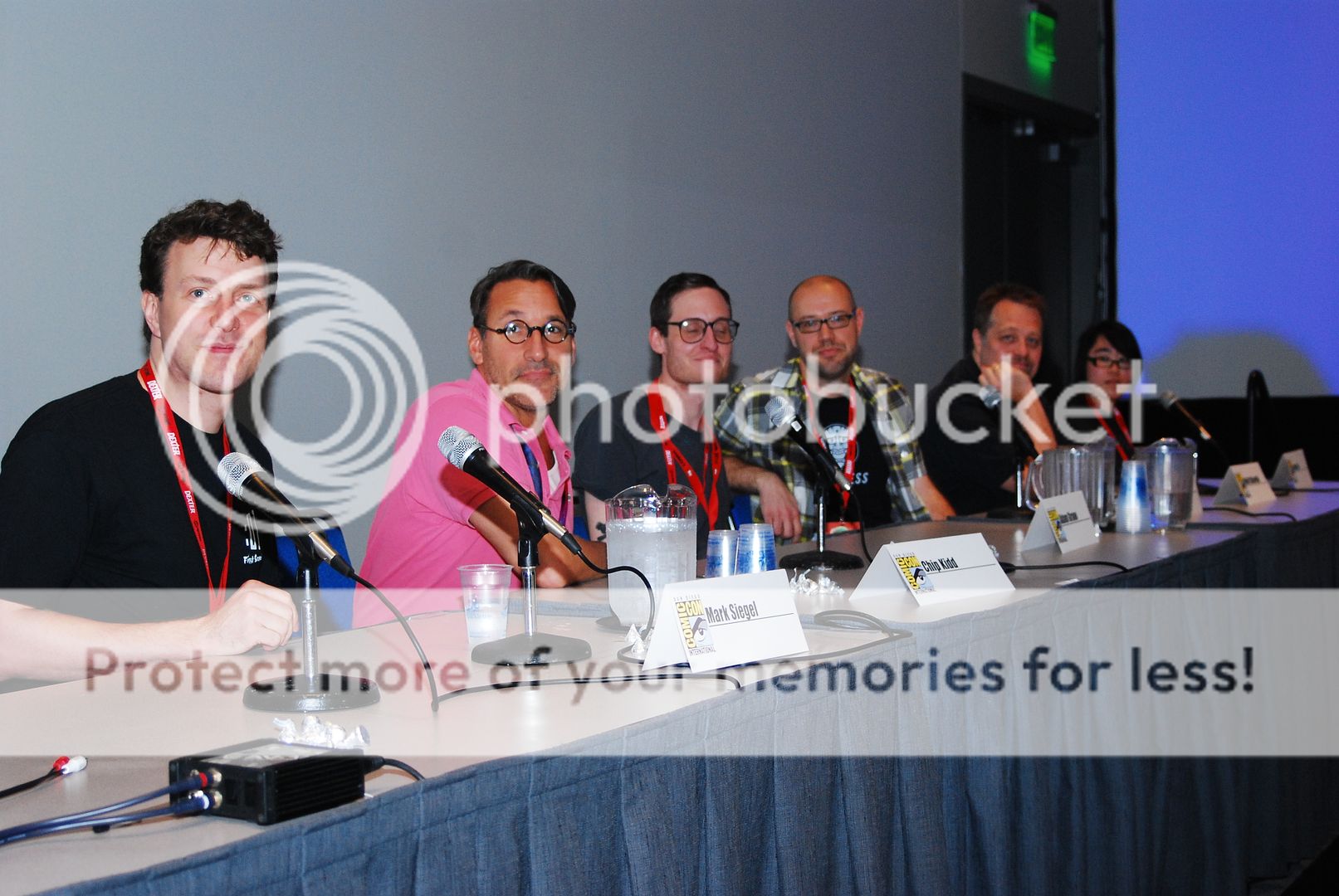
We are not ashamed to admit that here at ScriptPhD.com, we are secret design nerds. We love it, particularly since good design so often elevates the content of films, television, and books, but is a relatively mysterious process. One of THE most fascinating panels that we attended at Comic-Con 2010 was on the design secrets behind some of your favorite comics and book covers. A panel of the world’s leading designers revealed their methodologies (and sometimes failures) in the design process behind their hit pieces, lifting the shroud of secrecy that designers often envelop themselves in. An unparalleled purview into the mind of the designer, and the visual appeal that so often subliminally contributes to the success of a graphic novel, comic, or even regular book. We do, as it turns out, judge books by their covers.
As promised, we revisit this illuminating panel, and thank Christopher Butcher, co-founder of The Toronto Comic Arts Festival and co-owner of The Beguiling, Canada’s finest comics bookstore. Chris was kind enough to provide us with high-quality images of the Comics Design panel’s work, for which we at ScriptPhD.com are grateful. Chris had each of the graphic artists discuss their work with an example of design that worked, and design that didn’t (if available or so inclined). The artist was asked to deconstruct the logo or design and talk about the thought process behind it.
Mark Ciarello – (art + design director at DC Comics)
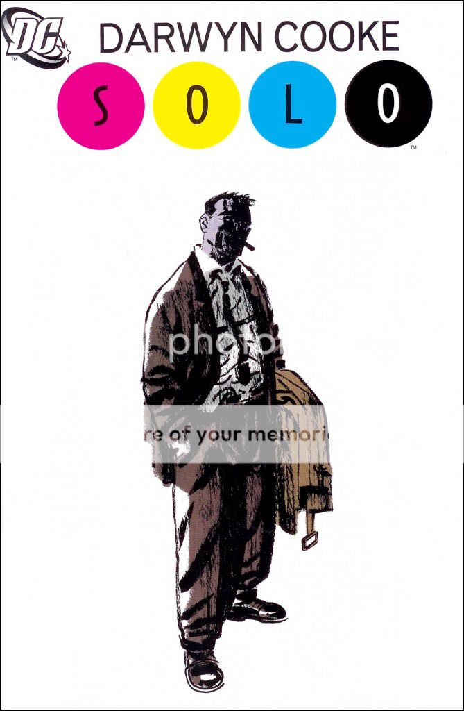
Mark chose to design the cover of this book with an overall emphasis on the individual artist. Hence the white space on the book, and a focus on the logo above the “solo” artist.
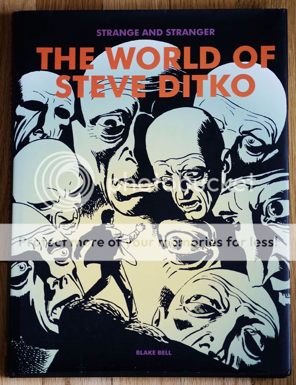
Adam Grano – (designer at Fantagraphics)

Adam took the title of this book quite literally, and let loose with his design to truly emphasize the title. He called it “method design.” He wanted the cover to look like a drunken dream.
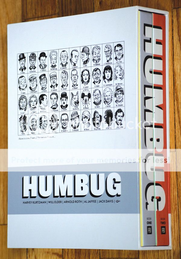
For the Humbug collection, Grano tried hard not to impress too much of himself (and his tastes) in the design of the cover. He wanted to inject simplicity in a project that would stand the test of time, because it was a collector’s series.
Grano considered this design project his “failure.” It contrasts greatly with the simplicity and elegance of Humbug. He mentioned that everyone on the page is scripted and gridded, something that designers try to avoid in comics.
Chip Kidd – (designer at Random House)
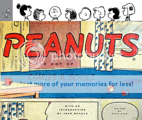
Chip Kidd had the honor of working on the first posthumous Peanuts release after Charles M. Schultz’s death, and took to the project quite seriously. In the cover, he wanted to deconstruct a Peanuts strip. All of the human element is taken out of the strip, with the characters on the cover up to their necks in suburban anxiety.
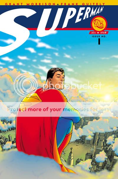
Kidd likes this cover because he considers it an updated spin on Superman. It’s not a classic Superman panel, so he designed a logo that deviated from the classic “Superman” logo to match.
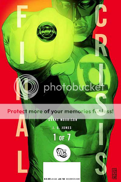
Kidd chose this as his design “failure”, but not the design itself. The cover represents one of seven volumes, in which the logo pictured disintegrates by the seventh issue, to match the crisis in the title. Kidd’s only regret here is that he was too subtle. He wishes he’d chosen to start the logo disintegration progression sooner, as there’s very little difference between the first few volumes.
Fawn Lau – (designer at VIZ)

Fawn was commissioned to redesign this book cover for an American audience. Keeping this in mind, and wanting the Japanese animation to be more legible for the American audience, she didn’t want too heavy-handed of a logo. In an utterly genius stroke of creativity, Lau went to an art store, bought $70 worth of art supplies, and played around with them until she constructed the “Picasso” logo. Clever, clever girl!
Mark Siegel – (First Second Books)
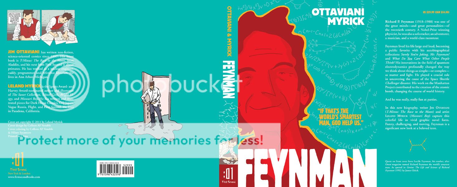
Mark Siegel was hired to create the cover of the new biography Feynman, an eponymous title about one of the most famous physicists of all time. Feynman was an amazing man who lived an amazing life, including a Nobel Prize in physics in 1965. His biographer, Ottaviani Myrick, a nuclear physicist and speed skating champion, is an equally accomplished individual. The design of the cover was therefore chosen to reflect their dynamic personalities. The colors were chosen to represent the atomic bomb and Los Alamos, New Mexico, where Feynman assisted in the development of The Manhattan Project. Incidentally, the quote on the cover – “If that’s the world’s smartest man, God help us!” – is from Feynman’s own mother.
Keith Wood – (Oni Press)

Wood remarked that this was the first time he was able to do design on a large scale, which really worked for this project. He chose a very basic color scheme, again to emphasize a collection standing the test of time, and designed all the covers simultaneously, including color schemes and graphics. He felt this gave the project a sense of connectedness.
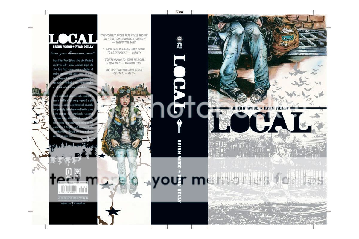
Wood chose a pantone silver as the base of this design with a stenciled typeface meant to look very modern. The back of the cover and the front of the cover were initially going to be reversed when the artists first brought him the renderings. However, Wood felt that since the book’s content is about the idea of a girl’s traveling across the United States, it would be more compelling and evocative to use feet/baggage as the front of the book. He was also the only graphic artist to show a progression of 10-12 renderings, playing with colors, panels and typeface, that led to the final design. He believes in a very traditional approach to design, which includes hand sketches and multiple renderings.
The Culture of Popular Things: Ethnographic Examinations of Comic-Con 2010
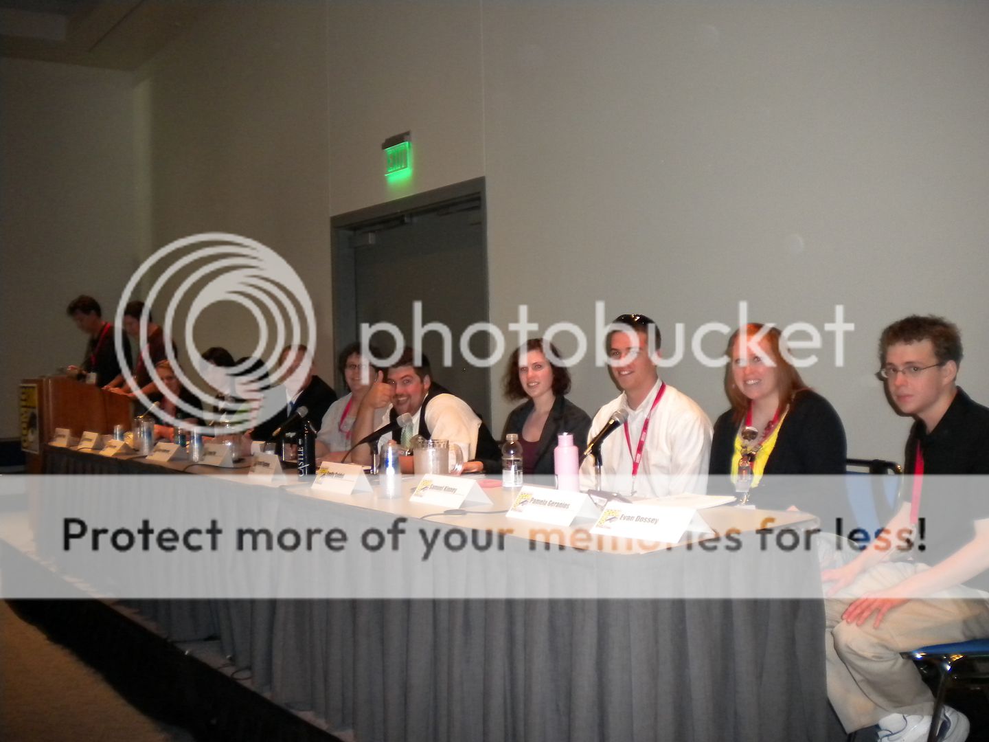
Each year, for the past four years, Comic-Con ends on an academic note. Matthew J. Smith, a professor at Wittenberg University in Ohio, takes along a cadre of students, graduate and undergraduate, to study Comic-Con; the nerds, the geeks, the entertainment component, the comics component, to ultimately understand the culture of what goes on in this fascinating microcosm of consumerism and fandom. By culture, the students embrace the accepted definition by famous anthropologist Raymond J. DeMallie: “what is understood by members of a group.” The students ultimately wanted to ask why people come to Comic-Con in general. They are united by the general forces of being fans; this is what is understood in their group. After milling around the various locales that constituted the Con, the students deduced that two ultimate forces were simultaneously at play. The fan culture drives and energizes the Con as a whole, while strong marketing forces were on display in the exhibit halls and panels.
Maxwell Wassmann, a political economy student at Wayne State University, pointed out that “secretly, what we’re talking about is the culture of buying things.” He compared Comic-Con as a giant shopping mall, a microcosm of our economic system in one place. “If you’ve spent at least 10 minutes at Comic-Con,” he pointed out, “you probably bought something or had something tried to be sold to you. Everything is about marketing.” As a whole, Comic-Con is subliminally designed to reinforce the idea that this piece of pop culture, which ultimately advertises an even greater subset of pop culture, is worth your money. Wassmann pointed out an advertising meme present throughout the weekend that we took notice of as well—garment-challenged ladies advertising the new Green Hornet movie. The movie itself is not terribly sexy, but by using garment-challenged ladies to espouse the very picture of the movie, when you leave Comic-Con and see a poster for Green Hornet, you will subconsciously link it to the sexy images you were exposed to in San Diego, greatly increasing your chances of wanting to see the film. By contrast, Wassmann also pointed out that there is a concomitant old-town economy happening; small comics. In the fringes of the exhibition center and the artists’ space, a totally different microcosm of consumerism and content exchange.
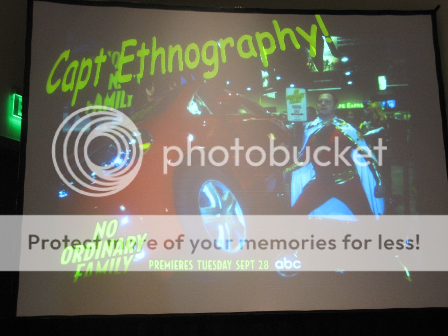
Kane Anderson, a PhD student at UC Santa Barbara getting his doctorate in “Superheroology” (seriously, why didn’t I think of that back in graduate school??), came to San Diego to observe how costumes relate to the superhero experience. To fully absorb himself in the experience, and to gain the trust of Con attendees that he’d be interviewing, Anderson came in full costume (see above picture). Overall, he deduced that the costume-goers, who we will openly admit to enjoying and photographing during our stay in San Diego, act as goodwill ambassadors for the characters and superheroes they represent. They also add to the fantasy and adventure of Comic-Con goers, creating the “experience.” The negative side to this is that it evokes a certain “looky-loo” effect, where people are actively seeking out, and singling out, costume-wearers, even though they only constitute 5% of all attendees.
Tanya Zuk, a media masters student from the University of Arizona, and Jacob Sigafoos, an undergraduate communications major at Wittenberg University, both took on the mighty Hollywood forces invading the Con, primarily the distribution of independent content, an enormous portion of the programming at Comic-Con (and a growing presence on the web). Zuk spoke about original video content, more distinctive of new media, is distributed primarily online. It allows for more exchange between creators and their audience than traditional content (such as film and cable television), and builds a community fanbase through organic interaction. Sigafoos expanded on this by talking about how to properly market such material to gain viral popularity—none at all! Lack of marketing, at least traditional forms, is the most successful way to promote a product. Producing a high-quality product, handing it off to friends, and promoting through social media is still the best way to grow a devoted following.
And speaking of Hollywood, their presence at Comic-Con is undeniable. Emily Saidel, a Master’s student at NYU, and Sam Kinney, a business/marketing student at Wittenberg University, both took on the behemoth forces of major studios hawking their products in what originally started out as a quite independent gathering. Saidel tackled Hollywood’s presence at Comic-Con, people’s acceptance/rejection thereof, and how comics are accepted by traditional academic disciplines as didactic tools in and of themselves. The common thread is a clash between the culture and the community. Being a member of a group is a relatively simple idea, but because Comic-Con is so large, it incorporates multiple communities, leading to tensions between those feeling on the outside (i.e. fringe comics or anime fans) versus those feeling on the inside (i.e. the more common mainstream fans). Comics fans would like to be part of that mainstream group and do show interest in those adaptations and changes (we’re all movie buffs, after all), noted Kinney, but feel that Comic-Con is bigger than what it should be.
But how much tension is there between the different subgroups and forces? The most salient example from last year’s Con was the invasion of the uber-mainstream Twilight fans, who not only created a ruckus on the streets of San Diego, but also usurped all the seats of the largest pavilion, Hall H, to wait for their panel, locking out other fans from seeing their panels. (No one was stabbed.) In reality, the supposed clash of cultures is blown out of proportion, with most fans not really feeling the tension. To boot, Seidel pointed out that tension isn’t necessarily a bad thing, either. She gave a metaphor of a rubber band, which only fulfills its purpose with tension. The different forces of Comic-Con work in different ways, if sometimes imperfectly. And that’s a good thing.
Incidentally, if you are reading this and interested in participating in the week-long program in San Diego next year, visit the official website of the Comic-Con field study for more information. Some of the benefits include: attending the Comic-Con programs of your choice, learning the tools of ethnographic investigation, and presenting the findings as part of a presentation to the Comics Arts Conference. Dr. Matthew Smith, who leads the field study every year, is not just a veteran attendee of Comic-Con, but also the author of The Power of Comics.
COMIC-CON SPOTLIGHT ON: Charles Yu, author of How To Live Safely in a Science Fictional Universe.
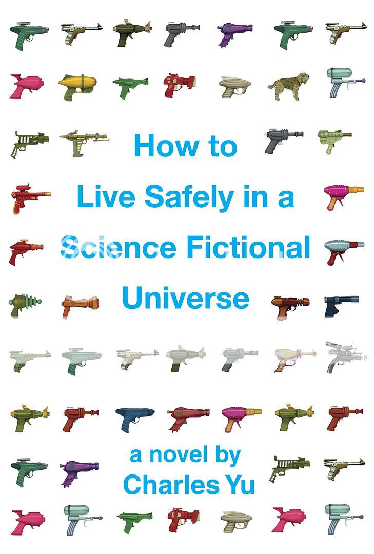
Here at ScriptPhD.com, we love hobnobbing with the scientific and entertainment elite and talking to writers and filmmakers at the top of their craft as much as the next website. But what we love even more is seeking out new talent, the makers of the books, movies and ideas that you’ll be talking about tomorrow, and being proud to be the first to showcase their work. This year, in our preparation for Comic-Con 2010, we ran across such an individual in Charles Yu, whose first novel, How To Live Safely in a Science Fictional Universe premieres this fall, and who spoke about it at a panel over the weekend. We had an opportunity to have lunch with Charles in Los Angeles just prior Comic-Con, and spoke in-depth about his new book, along with the state of sci-fi in current literature. We’re pretty sure Charles Yu is a name science fiction fans are going to be hearing for some time to come. ScriptPhD.com is proud to shine our 2010 Comic-Con spotlight on Charles and his debut novel, which is available September 7, 2010.
How To Live Safely in a Science Fictional Universe is the story of a son searching for his father… through quantum-space time. The story takes place on Minor Universe 31, a vast story-space on the outskirts of fiction, where paradox fluctuates like the stock market, lonely sexbots beckon failed protagonists, and time travel is serious business. Every day, people get into time machines and try to do the one thing they should never do: try to change the past. That’s where the main character, Charles Yu, time travel technician, steps in. Accompanied by TAMMY (who we consider the new Hal), an operating system with low self-esteem, and a nonexistent but ontologically valid dog named Ed, Charles helps save people from themselves. When he’s not on the job, Charles visits his mother (stuck in a one-hour cycle, she makes dinner over and over and over) and searches for his father, who invented time travel and then vanished.
Questions for Charles Yu

ScriptPhD.com: Charles, the story has tremendous traditional sci-fi roots. Can you discuss where the inspiration for this came from?
Charles Yu: Well the sci-fi angle definitely comes from being a kid in the 80s, when there were blockbuster sci-fi things all over the place. I’ve always loved [that time], as a casual fan, but also wanted to write it. I didn’t even start doing that until after I’d graduated from law school. I did write, growing up, but I never wrote fiction—I didn’t think I’d be any good at it! I wrote poetry in college, minored in it, actually. Fiction and poetry are both incredibly hard, and poetry takes more discipline, but at least when I failed in my early writing, it was a 100 words of failure, instead of 5,000 words of it.
SPhD: What were some of your biggest inspirations growing up (television or books) that contributed to your later work?
CY: Definitely The Foundation Trilogy. I remember reading that in the 8th grade, and I remember spending every waking moment reading, because it was the greatest thing I’d ever read. First of all, I was in the 8th grade, so I hadn’t read that many things, but the idea that Asimov created this entire self-contained universe, it was the first time that I’d been exposed to that idea. And then to have this psychohistory on top, it was kind of trippy. Psychohistory is the idea that social sciences can be just as rigorously captured with equations as any physical science. I think that series of books is the main thing that got me into sci-fi.
SPhD: Any regrets about having named the main character after yourself?
CY: Yes. For a very specific reason. People in my life are going to think it’s biographical, which it’s very much not. And it’s very natural for people to do that. And in my first book of short stories, none of the main characters was named after anyone, and still I had family members that asked if that was about our family, or people that gave me great feedback but then said, “How could you do that to your family?” And it was fiction! I don’t think the book could have gotten written had I not left that placeholder in, because the one thing that drove any sort of emotional connection for the story for me was the idea of having less things to worry about. The other thing is that because the main character is named after you, as you’re writing the book, it acts as a fuel or vector to help drive the emotional completion.
SPhD: In the world of your novel, people live in a lachrymose, technologically-driven society. Any commentary therein whatsoever on the technological numbing of our own current culture?
CY: Yes. But I didn’t mean it as a condemnation, in a sense. I wouldn’t make an overt statement about technology and society, but I am more interested in the way that technology can sometimes not connect people, but enable people’s tendency to isolate themselves. Certainly, technology has amazing connective possibilities, but that would have been a much different story, obviously. The emotional plot-level core of this book is a box. And that sort of drove everything from there. The technology is almost an emotional technology that [Charles, the main character] has invented with his dad. It’s a larger reflection of his inability to move past certain limitations that he’s put on himself.
SPhD: What drives Charles, the main character of this book?
CY: What’s really driving Charles emotionally is looking for his dad. But more than that, is trying to move through time, to navigate the past without getting stuck in it.
SPhD: Both of his companions are non-human. Any significance to that?
CY: It probably speaks more to my limitations as a writer [laughs]. That was all part of the lonely guy type that Charles is being portrayed as. If he had a human with him, he’d be a much different person.
SPhD: The book abounds in scientific jargon and technological terminology, which is par for the course in science fiction, but was still very ambitious. Do you have high expectations of the audience that will read this book?
CY: Yeah. I was just reading an interview where the writer essentially said “You can never go wrong by expecting too much [of your audience].” You can definitely go wrong the other way, because that would come off as terrible, or assuming that you know more. But actually, my concerns were more in the other direction, because I knew I was playing fast and loose with concepts that I know I don’t have a great grasp of. I’m writing from the level of amateur who likes reading science books, and studied science in college—an entertainment layreader. My worry was whether I was BSing too much [of the science]. There are parts where it’s clearly fictional science, but there are other parts that I cite things that are real, and is anyone who reads this who actually knows something about science going to say “What the heck is this guy saying?”
SPhD: How To Live… is written in a very atavistic, retro 80s style of science fiction, and really reminded me of the best of Isaac Asimov. How do you feel about the current state of sci-fi literature as relates to your book?
CY: Two really big keys for me, and things I was thinking about while writing [this book], were one, there is kind of a kitchiness to sci-fi, and I think that’s kind of intentional. It has a kind of do-it-yourself aesthetic to it. In my book, you basically have a guy in the garage with his dad, and yes the dad is an engineer, but it’s in a garage without great equipment, so it’s not going to look sleek, you can imagine what it’s going to look like—it’s going to look like something you’d build with things you have lying around in the garage. On the other hand, it is supposed to be this fully realized time machine, and you’re not supposed to be able to imagine it. Even now, when I’m in the library in the science-fiction section, I’ll often look for anthologies that are from the 80s, or the greatest time travel stories from the 20th Century that cover a much greater range of time than what’s being published now. It’s almost like the advancement of real-world technology is edging closer to what used to be the realm of science fiction. The way that I would think about that is that it’s not exploting what the real possibility of science fiction is, which is to explore a current world or any other completely strange world, but not a world totally envisionable ten years from now. You end up speculating on what’s possible or what’s easily extrapollatable from here; that’s not necessarily going to make for super emotional stories.
Charles Yu is a writer and attorney living in Los Angeles, CA.
Last, but certainly not least, is our final Costume of the Day. We chose this young ninja not only because of the coolness of his costume, but because of his quick wit. As we were taking the snapshot he said, “I’m smiling, you just can’t see it.” And a check mate to you, young sir.
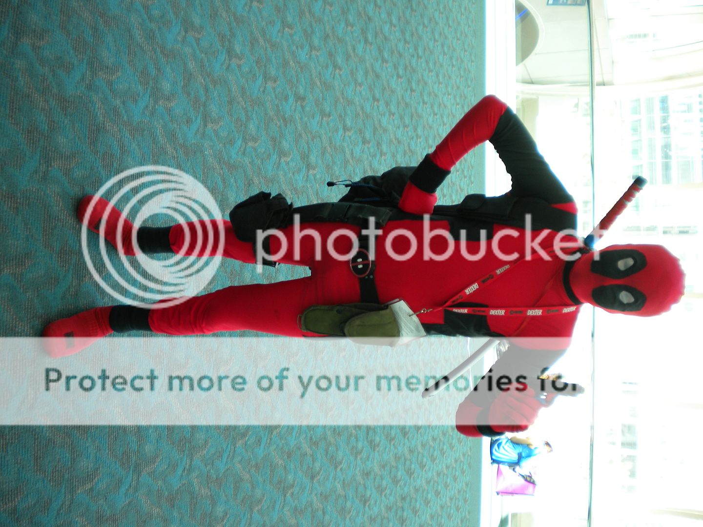
Incidentally, you can find much more photographic coverage of Comic-Con on our Facebook fan page. Become a fan, because this week, we will be announcing Comic-Con swag giveaways that only Facebook fans are eligible for.
~*ScriptPhD*~
*****************
ScriptPhD.com covers science and technology in entertainment, media and advertising. Hire our consulting company for creative content development.
Subscribe to free email notifications of new posts on our home page.
]]>
